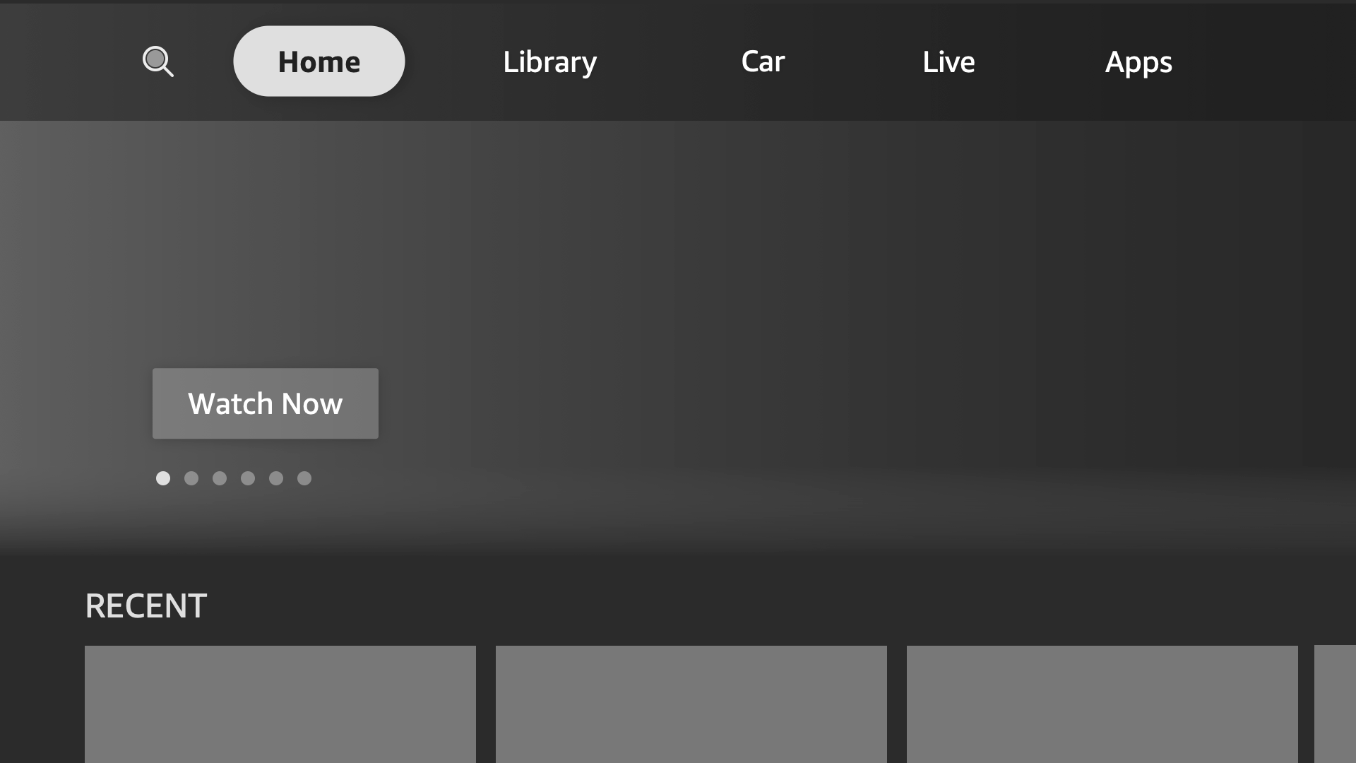
Automotive UX Guidelines
Fire TV is bringing TV from your home into your car. You can watch the same great shows and run the same apps as before. You can use your remote or voice to get to your favorite content. We’re also introducing touch and offline support to optimize the automotive experience.
- Viewing Distance
- Visual Guidelines
- Interaction Guidelines
- Onscreen Remote
- Network Connectivity Notifications
- Touch UI Tips

There are a number of key UX differences between Fire TV in an automobile and Fire TV in your home. The automotive UX has these distinct characteristics:
- It is optimized for a smaller screen, including improved legibility for text.
- It has multiple in-headrest displays or one single drop down display.
- It can be accessed through the remote, voice, or touch.
Here are some visual and interaction guidelines for development and design for vehicle-optimized Fire TV.
Viewing Distance
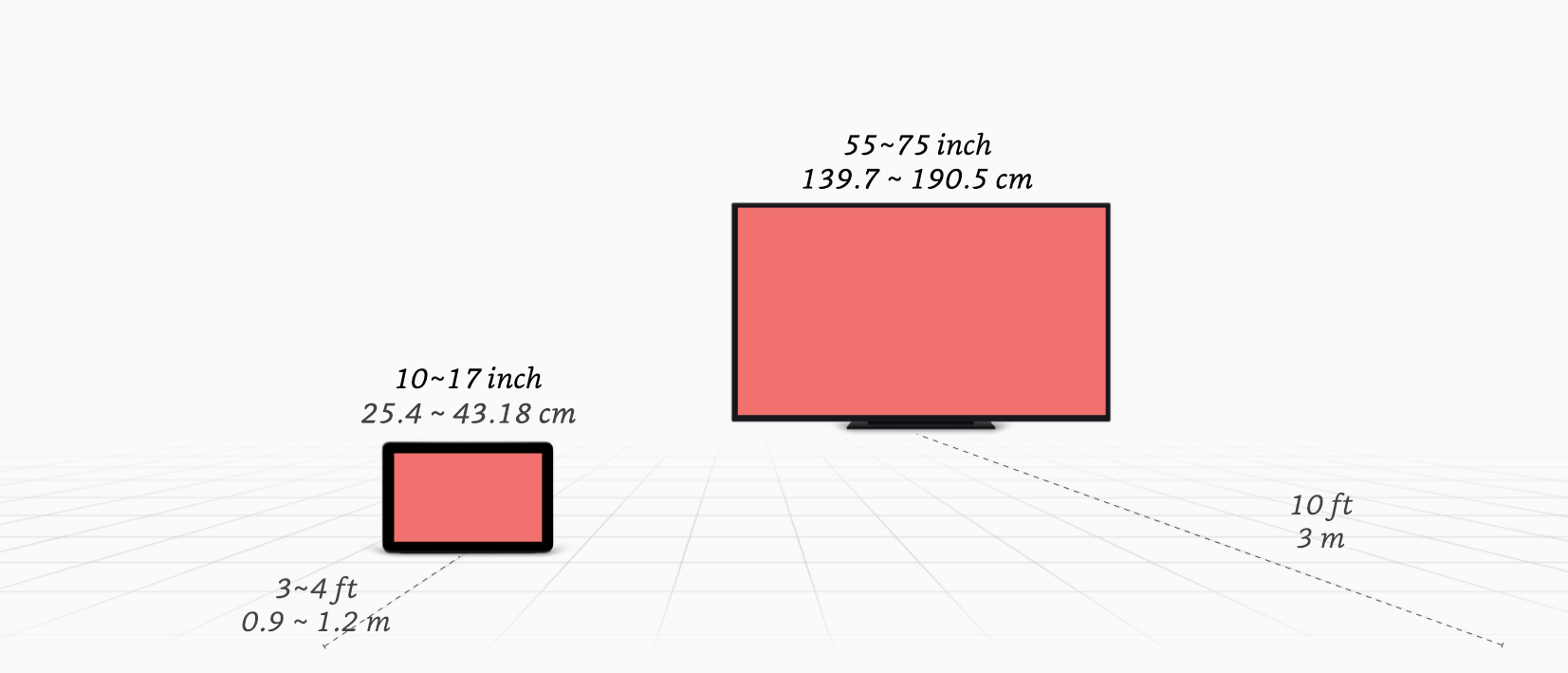
Keep in mind that the size of the screen is much smaller compared to a TV at home, and so is the viewing distance. See the following comparison.

Visual Guidelines
These guidelines ensure readability and ease of use:
| Attribute | Values |
|---|---|
| Minimum text size | Minimum text X-height: 4mm dp size = (4/25.4)*(pixel density/scale factor) |
| Minimum icon & touch target size | Minimum icon size: 12mm dp size = (12/25.4)*(pixel density/scale factor) Minimum touch target size: 18mm dp size = (18/25.4)*(pixel density/scale factor) |
Interaction Guidelines
Both the remote control and touch screen are enabled for screen interaction.
Touch interaction (in addition to remote control)

- When the screen is touched, back and home buttons appear (through a transparent overlay) for easy navigation. If inactive, it will time-out and the transparent overlay will disappear. These buttons also disappear when the remote is used.

For details on how to implement touch for Fire TV, see Add touch to Fire TV.
Onscreen Remote
If a 3P app doesn’t support touch at launch, the Onscreen Remote is activated to allow customers touch navigation. This is a failsafe. The Onscreen Remote will have remote-type functionality (Onscreen Remote and transport controls: the ability to scroll, select and control playback). This is to complete essential tasks in case the remote is lost or the battery is drained.


Network Connectivity Notifications
Since connectivity will likely be spotty on the road, the Fire TV UI adds notifications about connectivity. Developers don’t need to add these themselves.

Touch UI Tips
- The focus state is made for use with the remote only. During the transition to touch, disabling the focus state will make the UI intuitive for users. Enable the focus state again when switching back to the remote.
- When switching from the remote to touch mode, remove the focus state -
view.setFocusableInTouchMode(false). - If
setFocusableInTouchModeis set to false, and there’s no other custom scrolling/focus strategy implemented, the OS will take care of it by default.
- When switching from the remote to touch mode, remove the focus state -
- Allow users to touch and scroll through any part of the screen (multi-touch unavailable).
- Adhere to the touch icon and text size guidelines under Visual Guidelines.
- Grey out (disable) tiles that a user can’t access in offline mode.
- Use different color highlights to indicate states such as focused, selected, or activated.
Last updated: Jun 28, 2021

