

How it works
On an element wrapped byPressable:
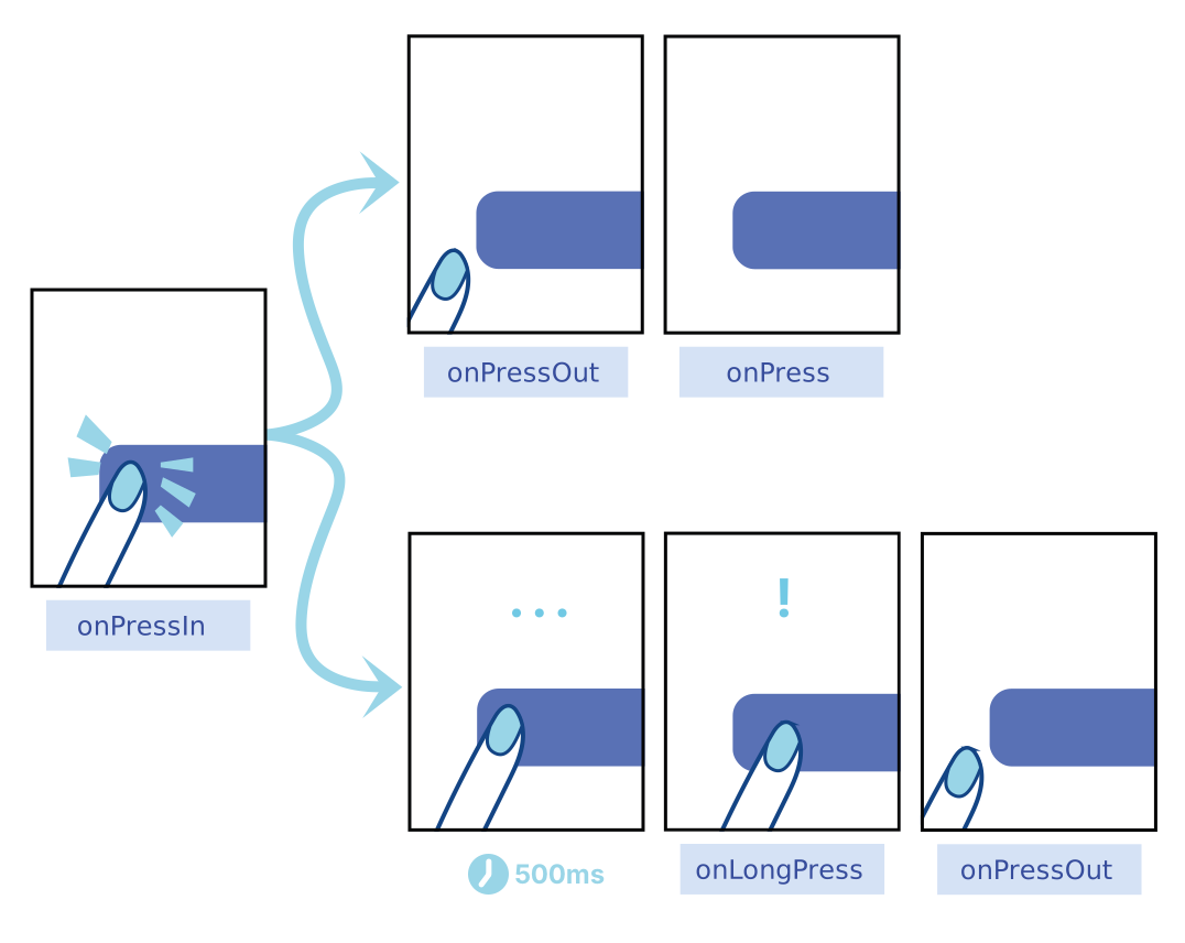
onPressInis called when a press is activated.onPressOutis called when the press gesture is deactivated.
onPressIn, one of two things will happen:
- The person will remove their finger, triggering
onPressOutfollowed byonPress. - If the person leaves their finger longer than 500 milliseconds before removing it,
onLongPressis triggered. (onPressOutwill still fire when they remove their finger.)
 Fingers are not the most precise instruments, and it is common for users to accidentally activate the wrong element or miss the activation area. To help,
 Pressable has an optional HitRect you can use to define how far a touch can register away from the wrapped element. Presses can start anywhere within a HitRect.
PressRect allows presses to move beyond the element and its HitRect while maintaining activation and being eligible for a “press”—think of sliding your finger slowly away from a button you’re pressing down on.
 You can set
 HitRect with hitSlop and set PressRect with pressRetentionOffset.
Example
Props
android_disableSound Android
If true, doesn’t play Android system sound on press.
android_ripple Android
Enables the Android ripple effect and configures its properties.
children
Either children or a function that receives a boolean reflecting whether the component is currently pressed.
unstable_pressDelay
Duration (in milliseconds) to wait after press down before calling onPressIn.
delayLongPress
Duration (in milliseconds) from onPressIn before onLongPress is called.
disabled
Whether the press behavior is disabled.
hitSlop
Sets additional distance outside of element in which a press can be detected.
onHoverIn
Called when the hover is activated to provide visual feedback.
onHoverOut
Called when the hover is deactivated to undo visual feedback.
onLongPress
Called if the time after onPressIn lasts longer than 500 milliseconds. This time period can be customized with delayLongPress.
onPress
Called after onPressOut.
onPressIn
Called immediately when a touch is engaged, before onPressOut and onPress.
onPressMove
Called when the press location moves.
onPressOut
Called when a touch is released.
pressRetentionOffset
Additional distance outside of this view in which a touch is considered a press before onPressOut is triggered.
style
Either view styles or a function that receives a boolean reflecting whether the component is currently pressed and returns view styles.
testOnly_pressed
Used only for documentation or testing (e.g. snapshot testing).
alexaEntityType Vega
alexaEntityType represents the value for the type of object that needs to be considered by Alexa UIController Interface. This is an optional prop and specific to Alexa UIController Interface support, it maps to the entity.type field from the Alexa UIController Interface (Alexa UIController API doc)
alexaExternalIds Vega
This is an optional prop and specific to Alexa UIController Interface support, it maps to the entity.ExternalIds field from the Alexa UIController Interface (Alexa UIController API doc)
entity.ExternalIds are the identifiers for this entity unique within the scope of this endpoint. The entity.externalIds field will be opaque to Alexa and will only be used to include in directives from Alexa. The identifiers reported in entity.externalIds are required to be understood by the endpoint on all directive commands that accept an entity structure.
ariaPosInSet Vega
The value for ariaPosInSet refers to the number of the element when the user can refer to the element by number, such as “Alexa, select number one.” the prop maps to ordinal property from Alexa UIController Interface (Alexa UIController API doc)
This prop is required if the app wants to allow user to perform voice selection based on the number.
Please note that providing the prop with a value does not result in the value being rendered automatically from the component, for a consistent user behavior, app needs to render the same ordinal value for the item.
aria-label Vega
aria-label is an accessibility prop (reference to React Native Doc), it can also be used specify the name of the item in voice selection, such as “Alexa, select Prime Video”.
This prop is required if the app wants to allow user to perform voice selection based on the name.
Please note that providing the prop with a value does not result in the value being render as the title of the component, app needs to explicted render the same text value for the item.
altLabels Vega
The value for altLabels refers to the list of alternate names for the item. (Renamed from keplerAltLabels)
This prop is required if the app wants to allow user to perform voice selection on the same item with different names.
enableSynchronousFocusEvents Vega
When set to true, onFocus/onBlur events will be dispatched synchronously, blocking the UI Thread until the JavaScript execution of onFocus/onBlur completes.
voiceOrdinal Vega
Add voiceOrdinal, used for ordinal selection for Voice Input.
hasTVPreferredFocus iOS Vega TV
TV preferred focus. May be set to true to force the TV focus engine to move focus to this view.
isTVSelectable iOS Vega TV
When set to true, this view will be focusable and navigable using the TV remote.
nextFocusDown Android Vega TV
Designates the next view to receive focus when the user navigates down. See the Android documentation.
nextFocusForward Android Vega TV
Designates the next view to receive focus when the user navigates forward. See the Android documentation.
nextFocusLeft Android Vega TV
Designates the next view to receive focus when the user navigates left. See the Android documentation.
nextFocusRight Android Vega TV
Designates the next view to receive focus when the user navigates right. See the Android documentation.
nextFocusUp Android Vega TV
Designates the next view to receive focus when the user navigates up. See the Android documentation.
Type Definitions
RippleConfig Android
Ripple effect configuration for the android_ripple property.
Properties:
