Alexa Blogs
In my previous post about the Space Explorer sample Alexa skill, I talked about how we approached the design for Space Explorer. I also discussed the overall goal of the project, the philosophy that guided our decision making, why we started with voice, and our thoughts on adapting the experience to suit the device.
This time around, I'll talk more about how we turned that design into reality using the new Alexa Presentation Language (APL), the Alexa Developer Portal, and AWS Lambda.
Building the Interaction Model
We started off by crafting our interaction model in the Alexa Developer Portal. Using the scripts we created as our guide (covered in the first post in this series), we started to create the various intents we knew we needed for users to navigate through the skill.
Before building out the rich visuals you see in the final experience, we started by scaffolding all of the layouts using simple text-based labels for each of our target views. We created a minimal set of utterances to support our intended navigation, and confirmed that the correct views were being served.
Example of the basic layouts used early in development.
Once the flows were complete, we spent some time expanding the utterances. We knew these basic utterances were only a starting point, so we added as many logical variations as we could think of to ensure we were covering as many scenarios as possible. For example, in addition to handling “Take me to Jupiter,” we account for “Go to Jupiter” and “Jupiter” as well. But we also knew we would never be able to think of all the possibilities on our own. This is where user testing is a great tool. We reached out to some of our colleagues and asked them to play with the voice interactions in the skills and try to navigate around. Their feedback led to us handling a few more utterances than the original set we considered, resulting in a skill that is more resilient than our initial implementation.
When the utterances were robust enough, we looked at how we could refine and make them easier to use in our back end when the time came. Enter slots. Slots are a great way to reduce the number of intents you need to handle on the back end, and make handling the target intent more convenient. Essentially, slots work like variables, with SlotTypes that map to predefined datasets (i.e. movies, actors, cities). Additionally, you can define custom SlotTypes that allow you to limit the set of accepted values for a given slot.
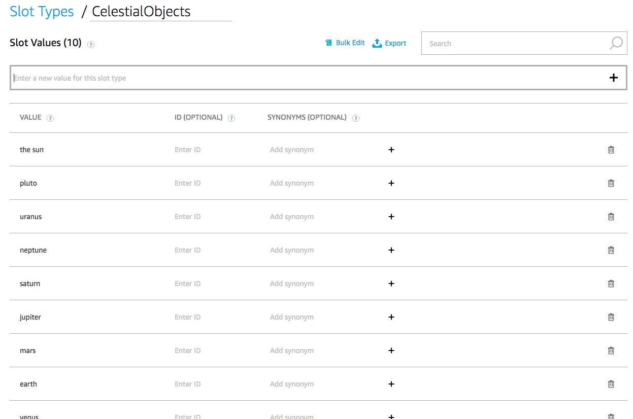
For example, we created a custom slot type called celestial_objects and filled it with all the available planets and dwarf planets we wanted to make navigable. When a customer says either, “Alexa, take me to Jupiter,” or, “Alexa, what's in Jupiter's atmosphere,” Alexa knows the slot value, and will always return the single, lowercase value “jupiter” from the celestial_objects type. By predefining a collection of available slot values, we have limited the set of terms that Alexa has to map to, increasing the odds of a meaningful utterance.
The last component of the voice design we implemented were the screen-based intents. These are the intents that let a customer navigate the screen content using their voice, such as titles or ordinals. Since these are not natively handled by APL yet, we had to implement them ourselves. For example, when presenting customers with lists of data, native Alexa experiences allow for selection using the item number or title, so we created custom intents to mimic that functionality.
If you need help getting started with your interaction model, take a look at the Related Resources at the end of this post.
Translating Designs into APL
With our scaffolded skill functioning, it was time to turn our attention to the visuals. APL, as we've mentioned before, gave us the freedom to be as creative with the layouts as we wanted, which meant we needed to figure out how to translate that creativity into actual code. We also needed to make sure that the designs were clear enough to guarantee we used the right components.
Just like with any UI development, our designs resulted in a series of redline-style documents to help guide the process. In addition to standard font-sizing and spacing guidelines, we made sure that we specifically included the touch target boundaries. This ensured we started off on the right track with components and minimized the amount of backtracking we had to do later on.
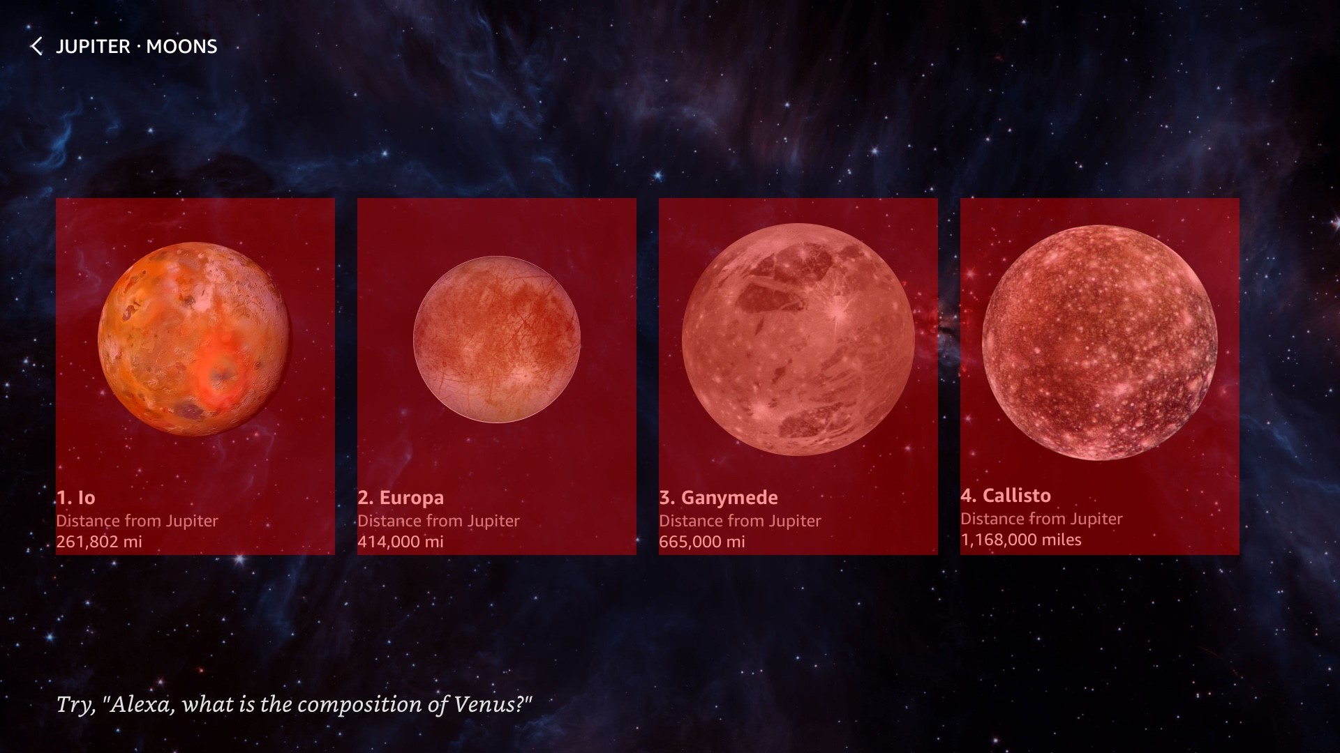
Example of the redline layers indicating touch targets
Importing Pre-Defined Style Packages
Throughout this skill, we're importing the alexa-styles and alexa-layouts packages from Alexa, as well as two additional custom packages served from our own CDN. The styles package provides developers a number of pre-built styles for text, spacing, colors, and more that have been developed to adapt to different viewport resolutions and viewing distances. In the layouts package, developers can find pre-built layout components developed by Amazon with the same adaptability as the styles package. We've used both extensively to make our development easier and we strongly recommend every developer do so, as well. For more information on what’s available, take a look at the Alexa Packages Overview documentation.
Below is an example import block using the Alexa packages and custom packages:
...
"import": [
    {
        "name": "alexa-styles",
        "version": "1.0.0"
    },
    {
        "name": "alexa-layouts",
        "version": "1.0.0"
    },
    {
        "name": "layouts",
        "version": "1.0.0",
        "source": "https://d1od0khoye9qi3.cloudfront.net/apl/layouts.json"
    },
    {
        "name": "styles",
        "version": "1.0.0",
        "source": "https://d1od0khoye9qi3.cloudfront.net/apl/styles.json"
    }
]
...
For example, in the following snippet from our custom layout package you can see how we use the AlexaHeader and AlexaFooter throughout the skill:
...
"ZoneList": {
    "parameters": [
        "backgroundImage",
        "title",
        "logo",
        "hintText",
        "listData"
    ],
    "items": [
        {
            "when": "${@viewportProfile != @hubRoundSmall}",
            "type": "Container",
            "height": "100vh",
            "width": "100vw",
            "direction": "column",
            "items": [
                ...
                {
                    "type": "AlexaHeader",
                    "headerTitle": "${title}",
                    "headerBackButton": 1,
                    "headerNavigationAction": "backEvent"
                },
                ...
                {
                    "type": "AlexaFooter",
                    "hintText": "${hintText}"
                }
            ]
        },
        ...
    ]
}
...
Notice the hintText property on the AlexFooter component. Using this property with a data transform, we can easily create a properly-formatted Alexa hint that references the device's active wake-word. Here's an example of how to use the textToHint transform in your APL datasources block:
"datasources": {
    "data": {
        "type": "object",
        "properties": {
            "hintText": "take me to Venus."
        },
        "transformers": [
            {
                "inputPath": "hintText",
                "outputName": "hint",
                "transformer": "textToHint"
            }
        ]
        }
    }
}
If the active wake word was “Alexa,” this would output the property hint, with the value 'Try, “Alexa, take me to Venus.”' For more information on this and other transforms, check out the tech docs.
We've also created our own custom packages for this skill. This gave us more freedom to reuse the same code across the skill and allowed us to circumvent the directive size limit for skills. This was especially important, as the size cap includes datasources, and can quickly outgrow the 24Kb ceiling.
Accommodating Different Viewports
APL is designed to minimize the number of layouts you need to create for your skills, but there are some key things we needed to do to make that as simple as possible. First, we primarily used percentage- or viewport-based units for most of our dimensions. That ensures that spacing and positioning aren't adversely impacted when the viewport dimensions are changed.
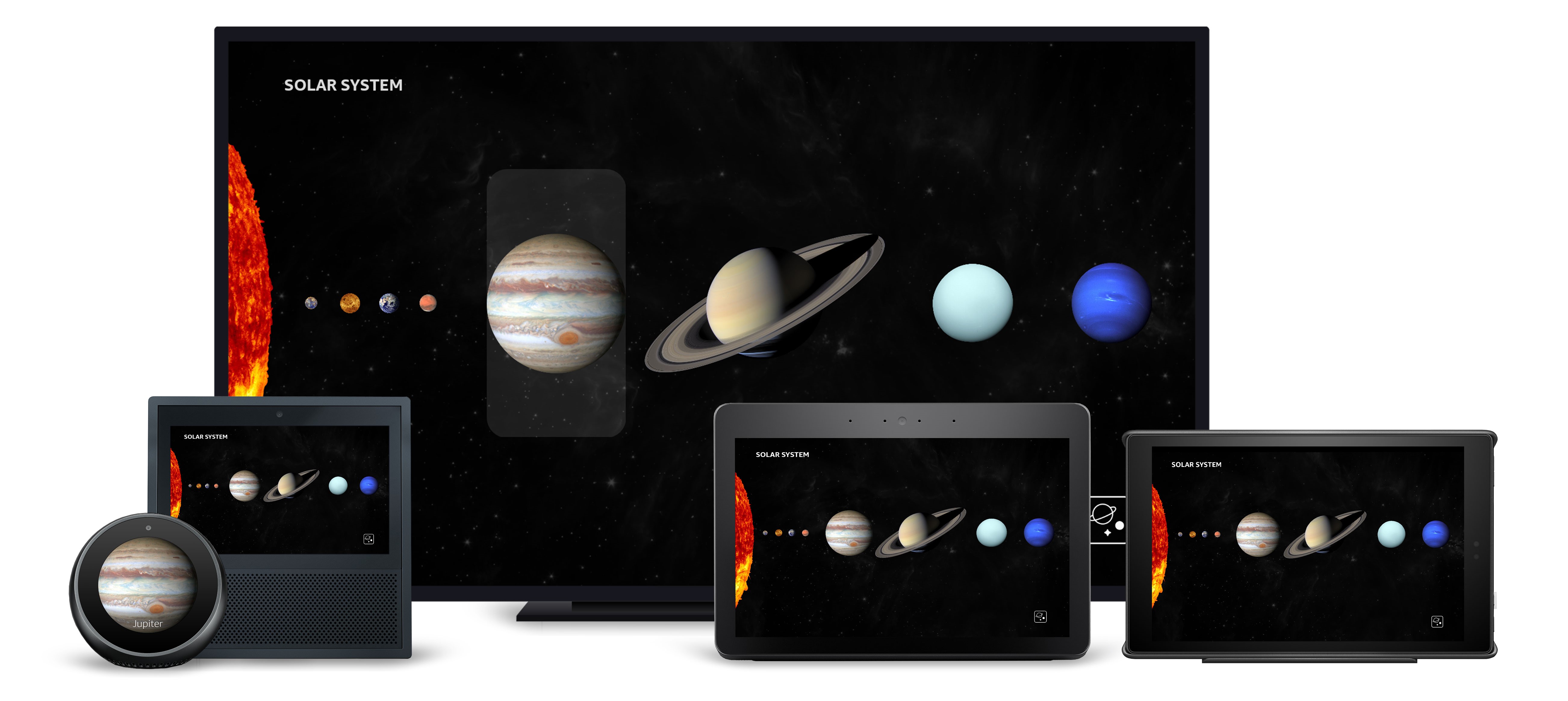
Second, we took advantage of APL's built-in conditional evaluation to show or hide elements, change dimension values or swap layouts entirely based on certain characteristics. This meant that we could show more information on larger displays, free up space on smaller displays, and drastically alter the layout for specific devices only. For instance, here's a what the APL for the main solar system screen looks like:
...
"mainTemplate": {
    "parameters": ["payload"],
    "item": {
        "type": "Frame",
        "backgroundColor": "black",
        "items": [
            {
                "when": "${@viewportProfile == @hubRoundSmall}",
                "type": "SolarSystemSmallRoundHub",
                "data": "${payload.data.properties.data}"
            },
            {
                "when": "${@viewportProfile != @hubRoundSmall}",
                "type": "SolarSystem",
                "data": "${payload.data.properties.data}"
            }
        ]
    }
}
...
In the above example, we use conditional statements to determine which layout to display based on a resource called viewportProfile, found in the alexa-styles package. This resource is also using conditional evaluation to change it's value based on the viewport characteristics sent by the device.
Using APL Components to Create Scalable Graphic Elements
One of the exciting things about APL is the flexibility to look beyond traditional layouts. Much like HTML and CSS, the possibilities for creating truly dynamic and interesting elements are endless. For Space Explorer, there were a handful of screens that challenged us to use APL in more interesting ways. Among those were the size comparison, distance, and element views.

The size comparison view uses variably shaped circles to represent the comparative sizing of different planets in our solar system. This effect could have been achieved using images, but that would not have given us the flexibility we needed to scale (and potentially introduced latency). As an alternative, we created the circles using APL Frames, dynamically sizing, coloring, and positioning them based on the characteristics of each planet.

The distance screen uses a similar methodology. To create the comparison graphics in this view, we built the circles and bars using the following layout from our custom layout package:
"DistanceGraphic": {
    "parameters": ["color", "name", "width", "active", "test"],
    "items": [
        {
            "type": "TouchWrapper",
            "width": "${width + '%'}",
            "height": "@indicatorSize",
            "spacing": "@indicatorSpacing",
            "onPress": {
                "type": "SendEvent",
                "arguments": ["distanceEvent", "${name}"]
            },
            "items": [
                {
                    "type": "Frame",
                    "width": "100%",
                    "height": "100%",
                    "borderRadius": "10dp",
                    "position": "absolute",
                    "inheritParentState": true,
                    "style": "backgroundWithFocusPress",
                    "item": {
                        "type": "Container",
                        "width": "100%",
                        "height": "100%",
                        "direction": "row",
                        "alignItems": "center",
                        "opacity": "${active ? 1 : 0.3}",
                        "items": [
                            {
                                "type": "Frame",
                                "height": "@indicatorStroke",
                                "grow": 1,
                                "backgroundColor": "${color}"
                            },
                            {
                                "type": "Frame",
                                "height": "@indicatorSize",
                                "width": "@indicatorSize",
                                "borderRadius": "@indicatorRadius",
                                "borderWidth": "@indicatorStroke",
                                "borderColor": "${color}",
                                "backgroundColor": "${active ? color : 'transparent'}"
                            }
                        ]
                    }
                }
            ]
        }
    ]
}
As you can see, the elements rely on percentage units to scale accordingly, which made both responsive layouts and dynamic sizing easier. We also use conditional statements to fill in the circles and raise the opacity of the active elements.
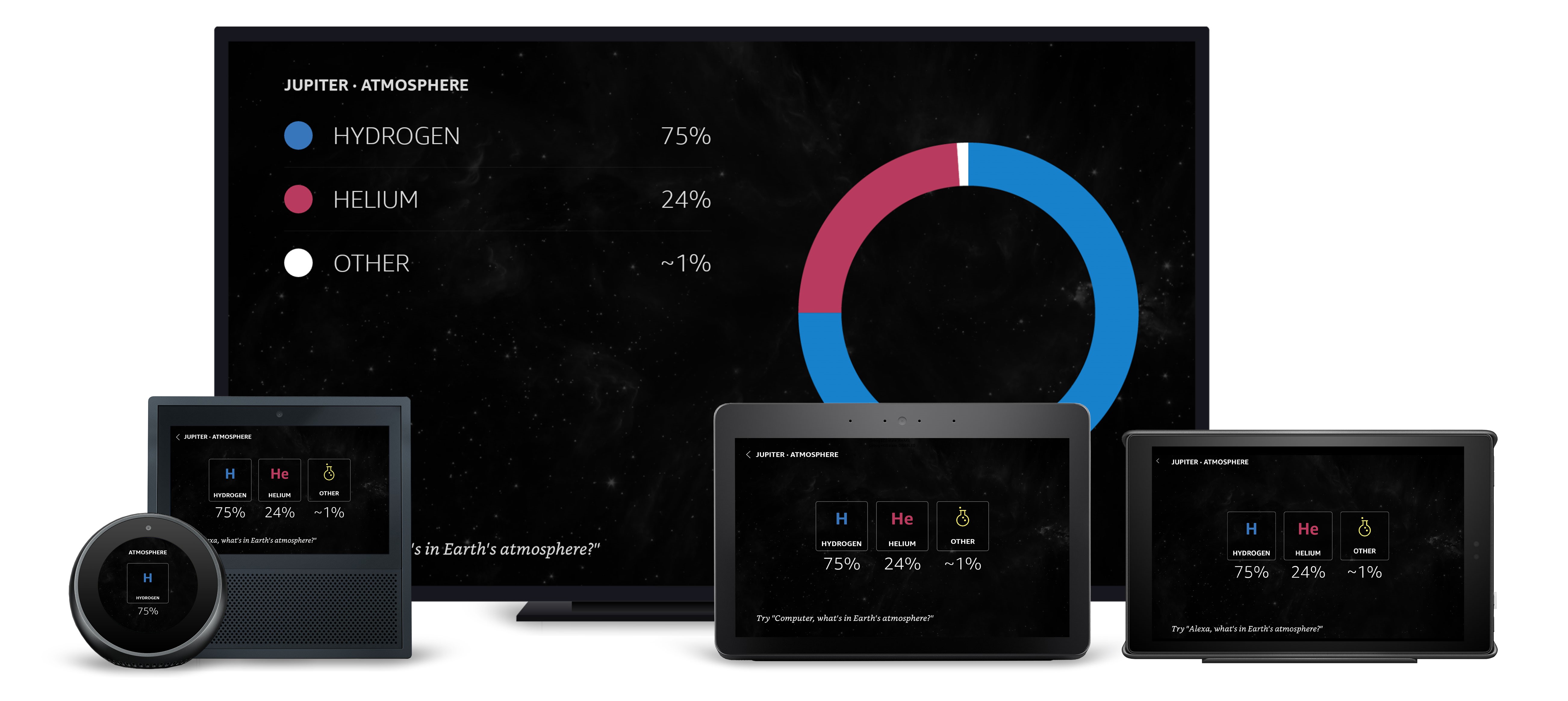
The atmospheric composition designs used a periodic table element style. Again, we could have achieved this with images, but APL allowed us to ensure the scaling, placement and crispness of the graphics would be consistent across all devices.
"Element": {
    "parameters": ["element", "notation", "title", "percentage", "color", "spacing"],
    "items": [
        ...
        {
            "type": "Container",
            "items": [
                {
                    "type": "Container",
                    "width": "${@isHubLandscapeSmall ? '18vw' : '200dp'}",
                    "height": "${@isHubLandscapeSmall ? '18vw' : '200dp'}",
                    "alignItems": "center",
                    "justifyContent": "spaceAround",
                    "spacing": "${spacing}",
                    "items": [
                        {
                            "type": "Frame",
                            "width": "100%",
                            "height": "100%",
                            "position": "absolute",
                            "top": 0,
                            "right": 0,
                            "bottom": 0,
                            "left": 0,
                            "borderWidth": "2dp",
                            "borderColor": "#FAFAFA",
                            "backgroundColor": "black",
                            "borderRadius": "8dp",
                            "opacity": 0.4
                        },
                        {
                            "when": "${element != 'other'}",
                            "type": "Text",
                            "style": "${@viewportProfile == @hubRoundSmall || @viewportProfile == @hubLandscapeSmall? 'textStyleDisplay3Alt' : 'textStyleDisplay4Alt' }",
                            "color": "${color}",
                            "text": "${notation}",
                            "height": "120dp",
                            "textAlignVertical": "center"
                        },
                        {
                            "when": "${element == 'other'}",
                            "type": "Image",
                            "source": "https://d1od0khoye9qi3.cloudfront.net/Beaker.png",
                            "width": "49dp",
                            "height": "83dp",
                            "scale": "best-fit"
                        },
                        {
                            "type": "Text",
                            "style": "textStyleDetail",
                            "textAlign": "center",
                            "text": "${title}"
                        }
                    ]
                },
                {
                    "type": "Text",
                    "style": "textStyleDisplay4",
                    "textAlign": "center",
                    "spacing": 8,
                    "text": "${percentage + '%'}"
                }
            ]
        }
    ]
}
To make sure the same component would adapt appropriately for larger displays, we created the elements to change form when the viewport characteristics were correct. You can see the full layout on our GitHub repo. Unfortunately, it just wasn't possible to create the donut graphs using APL elements alone, so we had to fall back to images for those assets.

For some screens, we had to be even more creative to achieve the effect the designs called for. The best example of that is the skill's launch screen. By creating a custom splash screen, we were able to launch the skill with a unique, branded experience while simultaneously masking the latency of loading images for our solar system view in the background.
 To do that with APL's current features, we created a layout that layers an Image component on top of the main solar system layout, which itself sits atop a ScrollView with a single Text component positioned off screen. When we handle the LaunchRequest, a RenderDocument directive is returned to display the launch layout, accompanied by an ExecuteCommand directive with a SpeakItem command targeting the hidden ScrollView's Text component. This command has a delay built in, so that any loading that needs to occur happens before the command is sent.
Finally, we used the OnScroll property of the ScrollView to tie the scroll position to the Image component's opacity, which resulted in the smooth fade effect we were after.
Here's the final layout:
{
    "parameters": ["payload"],
    "item": {
        "type": "Container",
        "direction": "column",
        "height": "100vh",
        "width": "100vw",
        "position": "absolute",
        "top": 0,
        "bottom": 0,
        "items": [
            {
                "type": "ScrollView",
                "width": "100%",
                "height": "100%",
                "position": "absolute",
                "onScroll": [
                    {
                        "type": "SetValue",
                        "componentId": "splashImage",
                        "property": "opacity",
                        "value": "${1 - (event.source.value * 2)}"
                    }
                ],
                "item": [
                    {
                        "type": "Container",
                        "paddingTop": "100vh",
                        "items": [
                            {
                                "type": "Text",
                                "text": "What would you like to explore?",
                                "opacity": "0",
                                "id": "splashScroller",
                                "paddingTop": "100vh",
                                "speech": "${payload.data.properties.speech}"
                            }
                        ]
                    }
                ]
            },
            {
                "type": "Container",
                "items": [
                    {
                        "when": "${@viewportProfile == @hubRoundSmall}",
                        "type": "SolarSystemSmallRoundHub",
                        "data": "${payload.data.properties.data}"
                    },
                    {
                        "when": "${@viewportProfile != @hubRoundSmall}",
                        "type": "SolarSystem",
                        "data": "${payload.data.properties.data}"
                    }
                ]
            },
            {
                "type": "Frame",
                "id": "splashImage",
                "backgroundColor": "black",
                "position": "absolute",
                "top": 0,
                "right": 0,
                "bottom": 0,
                "left": 0,
                "item": [
                    {
                        "type": "Container",
                        "width": "100vw",
                        "height": "100vh",
                        "justifyContent": "center",
                        "alignItems": "center",
                        "items": [
                            {
                                "type": "Text",
                                "style": "textStyleDisplay1Alt",
                                "fontSize": "20vh",
                                "fontWeight": "100",
                                "text": "SPACE",
                                "letterSpacing": "6.6vw"
                            },
                            {
                                "type": "Text",
                                "style": "textStyleHeadline",
                                "fontSize": "5.5vh",
                                "text": "EXPLORER",
                                "fontWeight": "800"
                            },
                            {
                                "type": "Image",
                                "width": "100vw",
                                "height": "100vh",
                                "scale": "best-fill",
                                "source": "@landingImage",
                                "position": "absolute"
                            }
                        ]
                    }
            ]
            }
        ]
    }
}
What's Next
With our voice and visual interactions built out, the next step is tying it all together. In our next post, we'll wrap up the Space Explorer deep dive by looking at how we used AWS Lambda to handle intents and user events, deliver directives, and manipulate our APL. Stay tuned.
Related Resources
- Space Explorer Sample Code
- Alexa Presentation Language Technical Documentation
- 10 Tips for Designing Alexa Skills with Visual Responses
- 4 Tips for Designing Voice-First Alexa Skills for Different Alexa-Enabled Devices
- How to Design Visual Components for Voice-First Alexa Skills
- How to Get Started with the Alexa Presentation Language to Build Multimodal Alexa Skills
